Trend Interval Logic
The reporting engine allows the creation of trends using a data source (E.g. 1m) for a longer period of time than the amount of pixels possible on a computer screen. This means the reports maintain accurate bandwidth reporting by aggregating flows into larger graph intervals while speeding up report load time. This process generally flattens out spikes due to a single data point representing several periods of time. As you narrow in on the time frame, the spikes become obvious again.
The trend interval logic becomes very important when trying to balance report rendering quickness with accuracy when running reports. By default:
Extended time frames (> 1 hour) are reported on using rolled up data.
The roll up process results in the majority of flows being discarded.
Reports over an hour do not represent 100% of the flows collected unless they are modified.
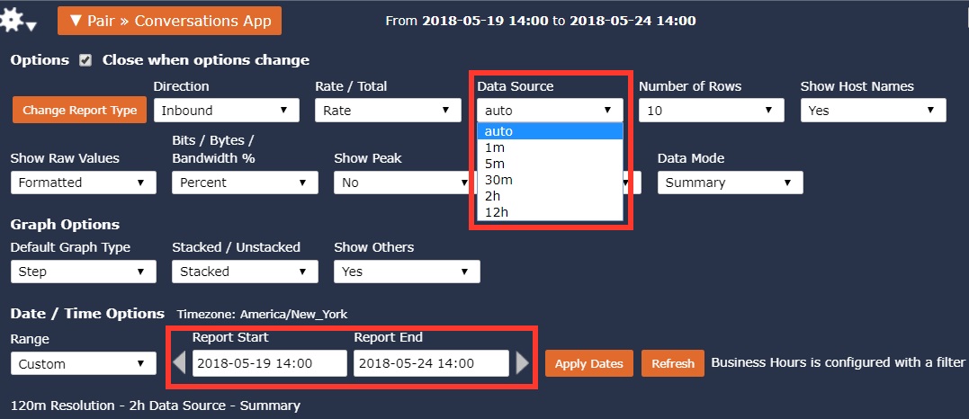
If the Data Source in the Gear menu is set to auto, intervals displayed is based on 60.
<= 60 minutes, display in 1 minute intervals
>60 minutes but, <=60 five minute intervals, display in 5 minute intervals
>60 five minute intervals but, <= 60 thirty minute intervals, display in 30 minute intervals
>60 thirty minute intervals but, <= 60 two hour intervals, display in 2hr intervals
etc. This logic is overridden when the Data Source is changed from ‘Auto’. See below.
The report engine team came up with a trending interval architecture which increases the accuracy of historical trends over longer periods of time. Looking at 5 days, for example, in one minute intervals results in 7200 data points. This is nearly impossible to fit on most computer screens. The architecture explained here allows for larger intervals such as 30 minutes to be generated using the non rolled up flows (I.e. summary or forensic). Therefore keeping the trends 100% accurate over extended periods of time. However, without enough computing power the trade off can come in performance.
All time frames are converted to minutes
When running a report, the time frame, regardless of the number of weeks, days or hours, is converted to minutes. For example, 24 hours is 1440 minutes. This is done to determine how many minutes apart the intervals are in a trend as explained below in the section “How Intervals Snap”.
Target Graphed Intervals
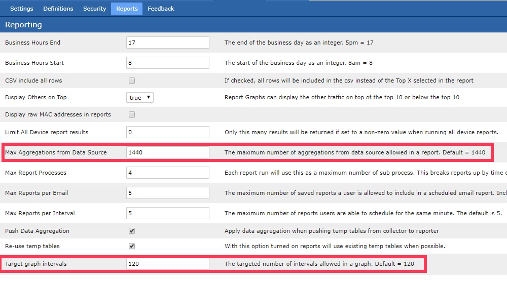
The “Target graph intervals” setting which is set under Admin Tab > Settings > Reporting is used to determine the number of intervals in a trend. The “Target graph intervals” defaults to a value of 120 and the maximum value it can be set for is 1440 data points in a trend.
i (intervals)
i = minutes / Target graphed intervals
12 = 1440 / 120
12 = minutes between data points in the trend
The “Target graph intervals” value dictates the targeted number of intervals. In the example above, if the “Target graph intervals” is set to 120, the result is 120 intervals that are 12 minutes apart over a span of 1440 minutes. 120 * 12 = 1440. Remember, 1440 minutes = 24 hours.
How Intervals Snap
Every 12 minutes between data points is an odd number to trend by. For this reason, the reporting engine will snap the data points to intervals (i) that make more sense to the user. In this case, 12 minutes would snap to 10 minutes between intervals. The snap logic is as follows:
if ( i < 5 ) {
        trend every = i minutes;(allows for 1,2,3&4 min intervals)
}elsif ( i >= 5 && i < 8 ) {
        trend every = 5 minutes;
}elsif ( i >= 8 && i < 13 ) {
        trend every = 10 minutes;
}elsif ( i >= 13 && i < 18 ) {
        trend every = 15 minutes;
}elsif ( i >= 18 && i < 23 ) {
        trend every = 20 minutes;
}elsif ( i >= 23 && i < 44 ) {
        trend every = 30 minutes;
}elsif ( i >= 44 && i < 91 ) {
        trend every = 60 minutes;
}elsif ( i >= 91 && i < 150) {
        trend every = 120 minutes;
}elsif ( i >= 151 && I < 220 ) {
        trend every = 180 minutes;
… It continues to grow by 60 minute intervals
The above snapping to a higher or lower interval behavior is why the “Target graph intervals” is a target and not a maximum value. It is entirely possible that after snapping to a shorter interval, the number of intervals will exceed the “Target graph intervals”. This setting helps ensure that the reporting engine doesn’t get over burdened with unnecessary processing due to excessive intervals.
Time Frame Adjusts using Modulo Operation
Depending on the time interval, the start and end time selected could also need to be adjusted by the reporting engine. For example, if the interval is every 20 minutes and the start time is 3 days ago at 13:07 and the end time is today at 15:52, the start and end time will shift to the left to fall on stamps that are evenly divisible by the interval being utilized. The start time of 13:07 becomes 13:00 and the end time of 15:52 becomes 15:40. This start and end time logic applies the modulo operation.
Data Source
Reporting needs to consider the “Data Source” option which is also found in the Gear menu. The Data Source DOES NOT decide the interval, but it can impact the interval used in the trend. It is generally used to specify which tables to grab the data from. For example, using a 1m or 5m “Data Source” and a Target graph interval of 120, reporting on 24 hours will be in 10 minute intervals. However, a Data Source of 30m with the same settings would result in 30 min intervals.
The Data Source allows more granular data to be used in larger interval trends. This is important when doing forensic searches for data that may have been dropped by roll ups in higher intervals. For example, a 5 day trend using a data source of 1m (raw flows) could not be trended in 1 min intervals as this would be 7200 data points. However, 60 minute intervals using a 1m interval data source achieves the objective.
Max Aggregations from Data Source
As a protective measure to ensure that excessively long queries are not executed, the “Max Aggregations from Data Source” located in the Admin tab > Settings > Reporting is considered. For example, if the “Max Aggregations from Data Source” is set to 1440 and the “Data Source” is 1m, no more than 1440 1m intervals can be used to run the report. If the user selects a time frame that requires greater than the value found in “Max Aggregations from Data Source” (1440) than the reporting engine would automatically grab the data from the next higher interval “Data Source” which in this example would be 5m.
Review
In summary, several factors go into determining the time between data points in a trend.
Time frame selected (E.g. last 24 hours)
Data Source (auto, 1m, 5m, 30m, 2hr, 12hr)
Max Aggregations from Data Source (Default is 1440, the max is 10000)
Target graph intervals (Default is 120, the max is 1440)
The order of operations plays an important role when determining the number and tightness of datapoints in a trend. Below is an example using a 48 hour time period from 2018-05-16 7:23 – 2018-05-18 7:23.
The time frame desired is converted to minutes. 48 hours = 2880 minutes.
The “Data Source“ is considered and accepted if the “Max Aggregations from Data Source“ threshold is not breached. For example, a 2880 minute period with a “Data Source“ of 1m would be rejected and then modified by the reporting engine because the default “Max Aggregations from Data Source“ is 1440. A 48 hour period using a “Data Source“ of 1m would require increasing the “Max Aggregations from Data Source“ to at least 2880. In this example, with a “Max Aggregations from Data Source” set to 1440, the reporting engine would automatically increase the “Data Source“ from 1m to 5m.
Next the number of intervals is considered. If the “Target graph intervals“ setting is 120 the intervals would fall every 24 minutes = (2880 / 120). Snap logic would force the interval to every 30 minutes and modulo operation would move the start and end times to 2018-05-16 7:00 – 2018-05-18 7:00 respectively. If the “Target graph intervals” setting was increased from 120 to 1440, the intervals in the trend using the same data source would change to 2 minute intervals.
Warning
If the preference is for more data points, the values above can be increased. The compromise is performance as more data and more data points can result in slower rendering of reports.